
Please let me know! Just as encouragement...I'm going to give away one of my electronic cutter files to someone randomly drawn from all comments left on this post. Here's a pic of the file (it's not even up in the store yet).
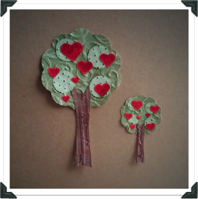
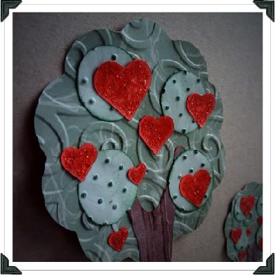
The one on the left is cut at about 3.5 inches tall, so would be great for a card front. The one on the right was just to show you that it cuts great even at 1 1/2 inches wide! That's right, it's the perfect size to use in combination on a tag (like in my TAG! You're it! challenge). I used some older K&Co Patterned paper for the tree leaves and ran it through my cuttlebug embossing folders (D'vine swirls and Swiss dots). I used some distress inks over top of the swiss dots embossed pieces to better match with the color of the large scalloped circle. The trunk is some Paper Studio "leather look" patterned paper, run through the Distress Stripes folder and inked to accent the bark pattern.
Thanks for looking! I hope to "hear" from you.
2/17 8:00 PM // ETA: I played with the image again and eliminated the swirls...just waiting to get the "a-OK" from TCBOTB to make sure I am allowed to keep the edit I did. I hope so! I really like it better without the interference.


Love the look of your blog! I would not have even noticed the swirls overlapping on the right if you hadn't mentioned them, so my thinking is, that it's a non-issue, unless it really bothers you.
ReplyDeleteI also love it and would leave it alone. But then I love swirls.
ReplyDeleteI see what you mean by the swirls overlaping.I didn't notice at first. Because the header swirl is darker I think it is fine.
ReplyDeleteGood job by the way.
I love the new look!! I think the "swirlies" are just fine where they are, and agree that if you remove them they would look unbalanced.
ReplyDeleteJan W. (jlwclanfam)
I like the new look, but I'm with you- I think it could be better. Maybe change the opacity or value of the background swirls, so they don't compete as much with your swirly heading or the text elsewhere on the page? But really, we wind up scrolling down so soon, it's probably not worth your time to tweak it.
ReplyDeleteLooks good. Not sure how you could make that swirl go down farther but it works. Games
ReplyDeleteI love the banner, although I do agree with you it does get in the way of the swirls in the background. Is there another background you can use that does not have that?? I definitely would not change your banner. I want to make one for my blog but cannot seem to find the time.
ReplyDeleteI personally think this is lovely! I adore the colors and love the swirls.
ReplyDeleteYour new design is quite amazing! Love it, too!
I, too, love the swirls... I don't think the overlapping is an issue, the ones on the background are quite faint and yours stand out!
ReplyDeleteCute tree too !
Another swirl lover! And, I love your banner =)
ReplyDeleteI love your header and I don't see the swirl problem. Must be screen size.
ReplyDeleteLove all of the layers and textures. Wonderful job!
ReplyDeleteYour blog looks great! I love the ribbons on the side and the header is pretty.
ReplyDeleteAlso love the file, by the way. Feel free to give it to me - LOL
http://slickcutz.blogspot.com/