-->

Thursday, February 18, 2010

New Die Cuts With a View stacks!

I know, I know...repeat after me...I DO NOT NEED ANY MORE SCRAPBOOKING PAPER!

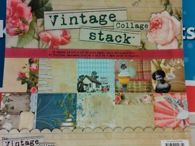
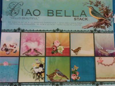
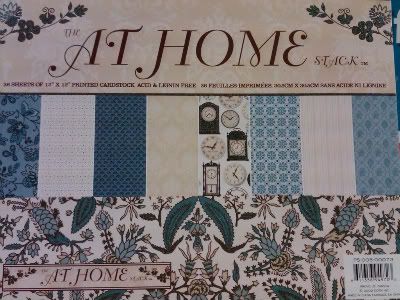
Did it work for you? Nah, me neither! I was at Michael's today and happened to see several new stacks from DCWV (which aren't listed on their website yet), so I thought I'd share some cell-phone pics with you.

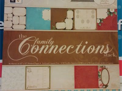
First is one for those of you "keeping the family tree". It's mostly sepia/aged colors, with some almost "pre-done" pages to make for some quick heritage scrapping.


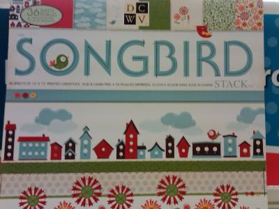
Next is a cheery stack with the "new thing", birds.


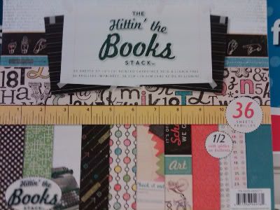
Which brings us back to school time...and time to "hit the books". Again the colors are aged, kind of shabby chic goes to college.


Ephemera lovers watch out! This stacks already got your altered antiques...


I'm not sure what "Ciao Bella" has to do with the birds, but they are kind of cute. I think they are rather large, however, and would be best if you were a one photo/cluster scrapper.


The last stack takes you back in time again...this one reminds me of toile.

Wednesday, February 17, 2010

What do you think?

So, I've been playing around with some blog backgrounds from The Cutest Blog on the Block and I've had a go at creating my own blog banner to try and match the "style" of the background. I'm looking for some honest opinions from you! I'm not quite happy with how the swirlies overlap with the background swirls up top, but I think it might be off balance if I take them away...what do you think?

Please let me know! Just as encouragement...I'm going to give away one of my electronic cutter files to someone randomly drawn from all comments left on this post. Here's a pic of the file (it's not even up in the store yet).


The one on the left is cut at about 3.5 inches tall, so would be great for a card front. The one on the right was just to show you that it cuts great even at 1 1/2 inches wide! That's right, it's the perfect size to use in combination on a tag (like in my TAG! You're it! challenge). I used some older K&Co Patterned paper for the tree leaves and ran it through my cuttlebug embossing folders (D'vine swirls and Swiss dots). I used some distress inks over top of the swiss dots embossed pieces to better match with the color of the large scalloped circle. The trunk is some Paper Studio "leather look" patterned paper, run through the Distress Stripes folder and inked to accent the bark pattern.


Thanks for looking! I hope to "hear" from you.


2/17 8:00 PM // ETA: I played with the image again and eliminated the swirls...just waiting to get the "a-OK" from TCBOTB to make sure I am allowed to keep the edit I did. I hope so! I really like it better without the interference.

Sunday, February 14, 2010

I appreciate you!

Thanks so much for all your support over the last 3 years! That's right! It's the 3rd annual Customer Appreciation Day at Paperthreads!

So first off, ALL of my files are on sale, today only, for 50% off. That's right, even my Monogram Tiles and the rest of my 10 newest files are all on sale for a super great deal! But it ends tonight at midnight, so you'd better hurry!

I also have a freebie to share with you today. It's my Heart Doily file, and includes AI, GSD, KNK, WPC14, and SVG file types, so it's perfect for most any electronic die cutter.


Just click on the photo to download the zip file. Please remember that even though it's shared freely here today, it's still governed by my terms of use. Instead of sharing the file with your friends, send then here to pick it up for themselves! And if you like what you see, please leave some love in the comments below! Enjoy the rest of the Paperthreads Blog Hop!

Saturday, February 13, 2010

TAG! You're it! - Challenge at Paperthreads

Just to let you know...I'm running a tag sketch challenge over at the Paperthreads forum! Check it out HERE.

Just for playing along you'll receive some free cutter files, and you'll have a chance to win some goodies too!

Friday, February 12, 2010

3rd Annual Customer Appreciation Day at Paperthreads!

Woo-hoo! It's going to be a fabulous celebration at Paperthreads! It's the 3rd annual CAD, and the designers want to give you the presents! Check out the challenges at the forum, activities and special treats on many of the designers blogs, and fantastic sales in the store.

In fact, the sale on all of my files starts in just a few hours! Saturday and Sunday you can get any of my designs for 20% off, but it doesn't end there! Make sure to check out my blog later on this weekend for even more exciting news!

Sunday, February 7, 2010

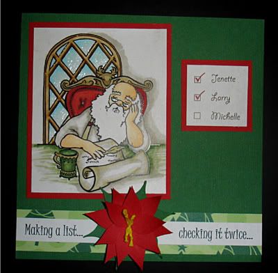
Mojo Monday 124 and a card for Larry

I finished making my card for the RAK for Larry...you can find out more about this HERE at Shirley Clark's blog.

I wanted to get the pics posted tonight, to make it in time for Mojo Monday's challenge 124. It's a CONTEST this week! Woo-hoo!

Here's the sketch...


And here's my take on it...


I apologize for the lighting! It's quite dark right now...I'll try reposting some better pics when I can get some light tomorrow. You can kind of see the gloss over the windows. I put Mod Podge glossy over the panes of glass and Santa's glasses.

In my haste I forgot to share the source of the Santa art! I downloaded it from Elizabeth O. Dulemba's coloring pages and re-sized before printing it out. Colored in afterwards with copics, of course.

I made the poinsettia on my KNK and then tied "stamens" out of gold colored DMC floss.

Monday, February 1, 2010

Combining Challenges!

I was so proud of myself last night. I was able to combine 3 challenges into one card! (Of course in the time it took to come up with it I probably could have created three cards...but that's another story.)
The sketch idea itself is another from Card Positioning Systems wk 152.


The Cuttlebug Challenge was to create a vintage Valentine...

The card also fits the rules for the Red Heart Card challenge at Caardvarks. The challenge was to make a card with something red, and to include hearts. I made a Valentine's Day "tangle" that includes hearts, locks, and keys.


The tangle of keys and locks was cut on my KNK with some "lipstick red" vinyl I had on hand and applied to a vintage sheet of music paper I printed out. Please forgive me! I got it as a free download from an online site, the name just escapes me right now and I can't seem to find it in the browser history. The card itself is kraft edges with Frayed burlap Distress ink. I thought the bracket edges reminded me of the triangles in the CPS sketch above.

Thanks for looking!